Chrona
Ambient timesheet software
Role
Lead UI/UX Designer
Team
Design Consultants
Design Engineers
Graphic Designers
UX Designers
Project Managers
Responsibilities
UX Research
User Workflow Mapping
Interaction Design
Information Architecture
Usability Testing
Prototyping
Tools
Figma
Illustrator
Photoshop
After Effects
Outcome
A private, streamlined, AI-powered timesheet experience that minimises manual input while improving accuracy, clarity, and user confidence.

Context
This started as a UX challenge: design an internal timesheet system for a large organisation with mixed attitudes towards time tracking.
- Some teams rely on hourly billing
- Others actively resist timesheets
- Accuracy is poor, but still relied upon
Background
Two years ago, working in a consultancy where timesheeting was mandatory, I became convinced the problem wasn’t the UI, it was the model. Around the same time I grew increasingly interested in where AI implementation was going wrong in products: too much automation, too little transparency.
This project is where both ideas converged.
Research
I started with secondary research including industry reports, HR literature, and existing timesheet tool critiques, to understand whether this was a real problem or just an annoying one.
Three things stood out.
Inaccuracy is structural. Memory degrades fast. A UI redesign on a memory-based system wouldn’t fix anything; it would just be a prettier version of the same failure.
The cost falls on the wrong person. Individuals rarely feel the consequences of a vague timesheet. Project managers do – in missed deadlines and blown budgets. That disconnect kills the incentive to be accurate.
Most tools optimise for submission, not accuracy.
”Timesheets aren't inaccurate because people are careless, they're inaccurate because they're built on memory.
Research finding
The key insight
Timesheets fail at the moment you open them.
Not because of attitude or bad UI, but because the information needed to fill them in accurately is already gone.
The opportunity was to make manual time logging unnecessary.
A different approach
Instead of asking users to log time, Chrona captures work as it happens and reconstructs it automatically, using on-device machine learning to turn raw activity into structured, reviewable sessions.
Chrona passively observes activity signals from the tools you already use, then applies a local inference model to group that activity into sessions, cross-reference against your project management tools, and assign a confidence score to each entry based on the consistency and clarity of the underlying signals.
This way, timesheets become something you quickly approve at the end of the day.
OLD MODEL
NEW MODEL
One obvious problem
Capturing work passively raises an immediate question: who’s watching?
Any system that observes activity risks feeling like surveillance, and the research was clear that this perception already exists with traditional timesheets. A tool that actually monitors your screen would need to clear a much higher bar.
That meant two things had to be true from the start. Everything had to stay on-device. And users had to understand exactly what was being captured and why.
Privacy and transparency were design requirements from day one.
⚠ THE RISK
✓ THE REQUIREMENT
Designed around real work, not reported work
Alex Marazzi
Product Designer, 29
Alex works across multiple projects in a fast-paced consultancy, the kind of environment where time is billable and timesheets are non-negotiable.
By 5pm, the shape of the day has collapsed into a blur of Figma, Slack threads, and half-finished conversations. Logging time accurately means reconstructing something that no longer exists.
How Alex works
- Deep work in long uninterrupted blocks
- Constantly context-switching between design, comms, and research
- Never logs time in the moment
Where it breaks
- Can’t reconstruct the day accurately by end of day
- Timesheeting breaks flow and feels like admin
- Submits estimates, knowing they’re not right
What would help
- Capture work without interrupting it
- Review, not reconstruct
- Confidence that what’s submitted is accurate
“If it already knew what I’d been doing, I’d just check it and move on.”
Chrona is built around this exact behaviour: capturing work passively and accurately, then surfacing for quick review.
System requirements
Chrona needed to do something most software avoids: infer intent from messy, fragmented activity. Here’s how the system is designed to do that without losing user trust.
Capture happens on-device
No raw activity streams leave the machine. Users opt in to specific apps and domains, so nothing is tracked without explicit permission.
Signals grouped into sessions
App combinations, interaction patterns, and context-switching behaviour are used to infer what the user was working on and for how long.
Every session gets a score
High confidence means quick approval. Low confidence gets flagged for review. The system only asks for attention where it's needed.
Nothing is a black box
Every inferred session shows which apps contributed, which files were open, and how time was distributed. Users can correct any decision.
The result: the user's role shifts from logging work to validating it.
Interaction model
A continuous loop
Chrona is a system that improves with every interaction. Each time a user reviews, corrects, or approves a session, that input feeds back into the inference model, making future sessions more accurate and requiring less attention over time.
The goal isn’t perfect automation from day one, but reducing required effort over time.
The core experience
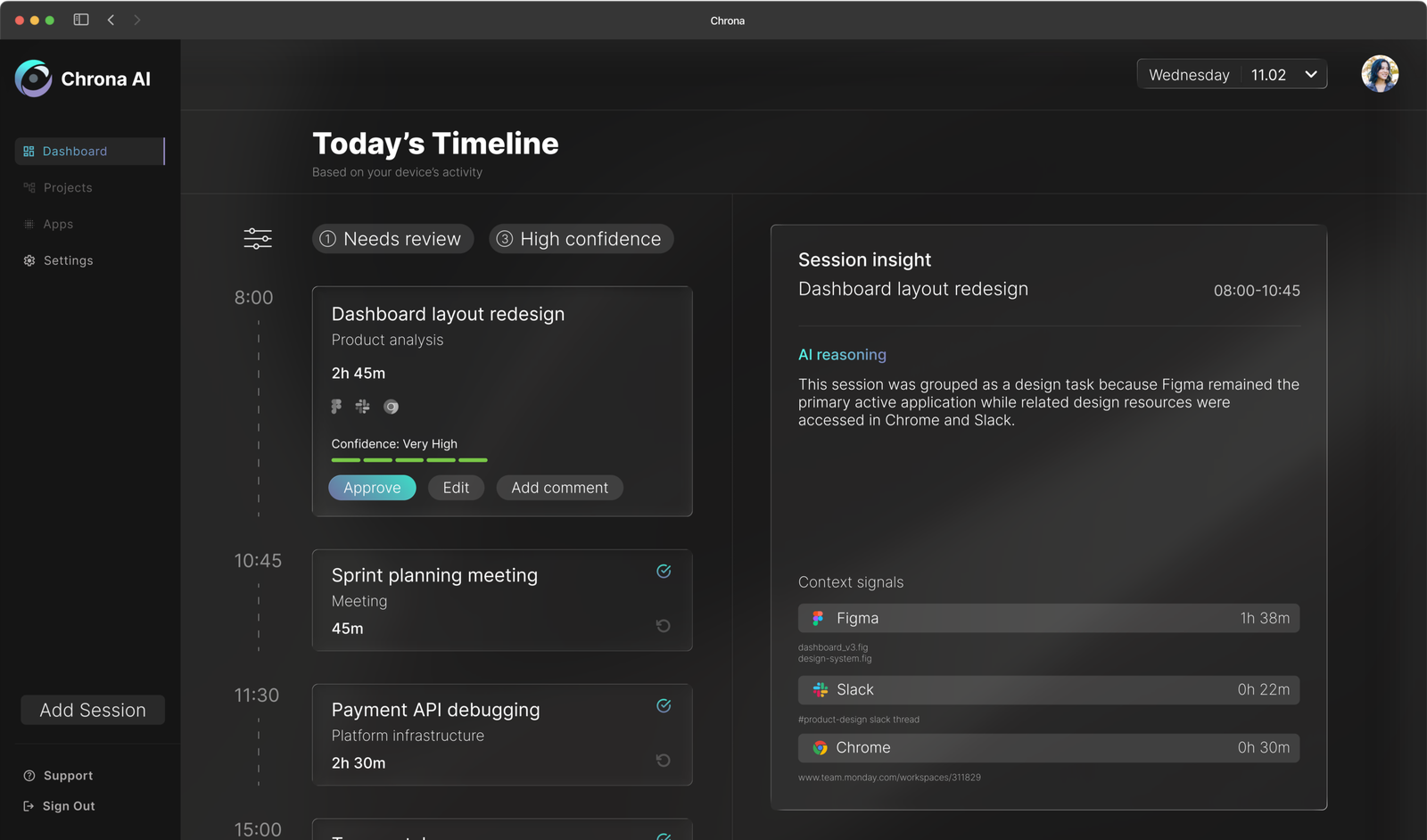
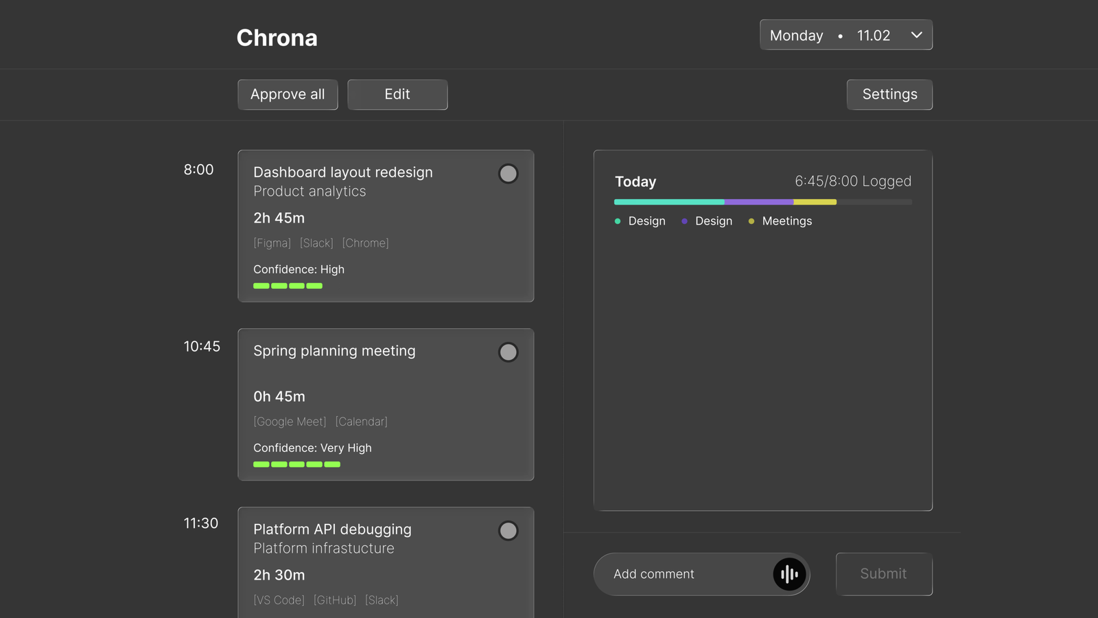
1. Ambient Timeline
You open Chrona and your day is already there, sessions grouped, durations calculated, tasks inferred from the tools you were actually using. Nothing to fill in. Everything to review.
Sessions grouped automatically
Durations inferred from real activity
Tasks suggested from your PM tools
You’re validating time, not logging it.
2. Confidence-Based Workflow
Not every session needs the same amount of attention. Chrona scores each entry based on the strength and consistency of the underlying signals. High-confidence sessions can be approved in a single click, and attention is reserved for entries that actually need it.
High confidence → quick approval
Low confidence → flagged for review
Reduces effort without sacrificing accuracy.


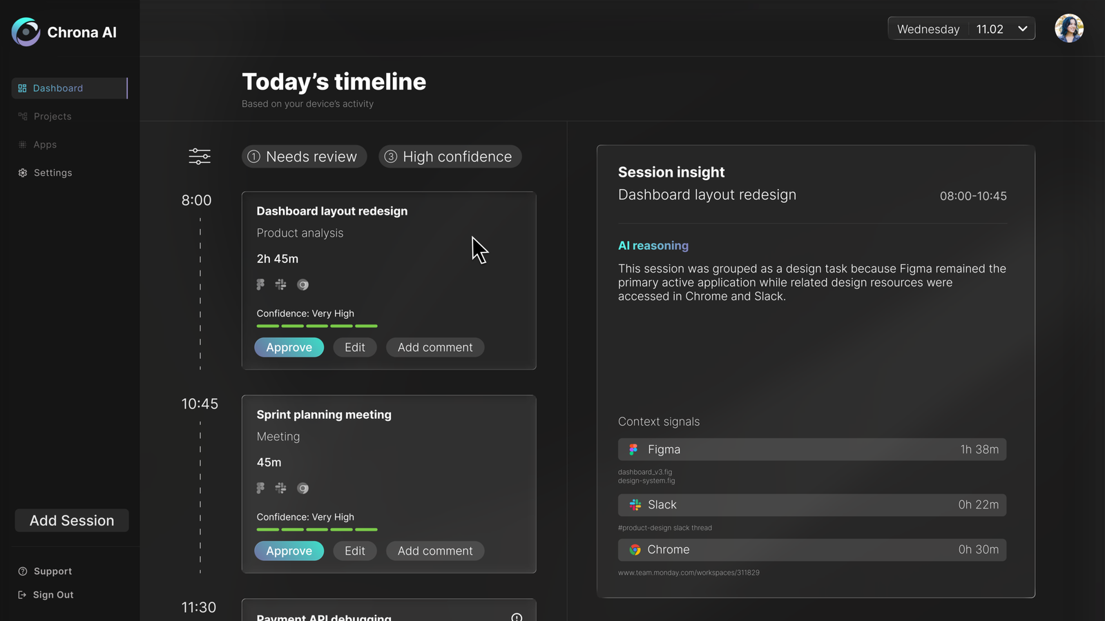
3. Transparent AI
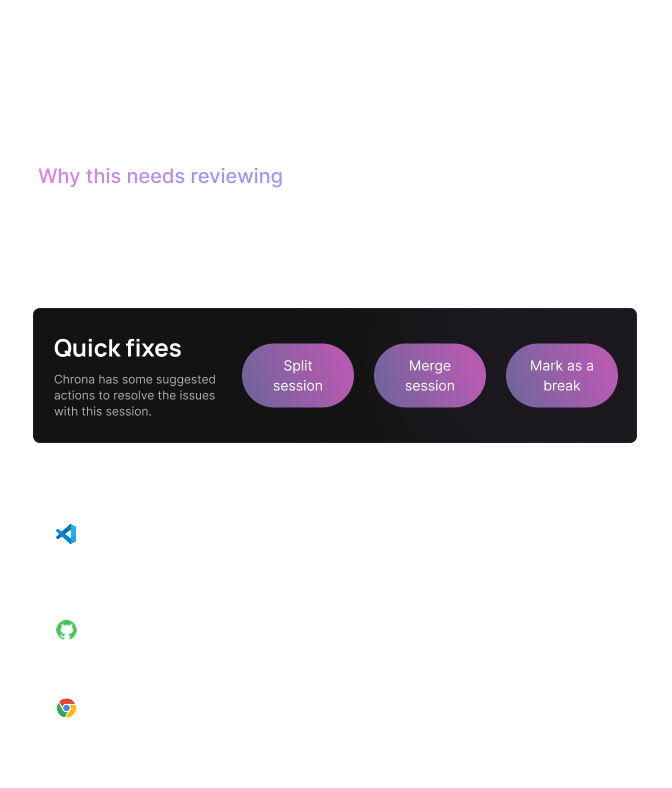
Every decision Chrona makes is explainable. Hovering on any session opens a full breakdown of the signals that shaped it – which apps were active, which files were open, how long each contributed. If the system gets something wrong, users can see exactly why and correct it immediately.
Explains the parameters behind decisions.
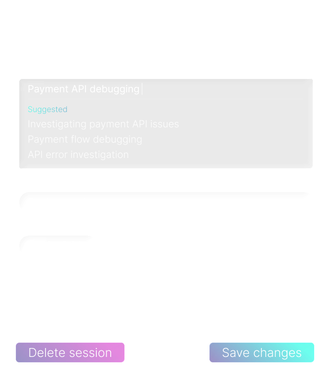
4. Resolve & Edit
When Chrona flags a session, it doesn’t just identify the problem; it suggests how to fix it. A diagnostic panel breaks down exactly why the session needs attention, and quick actions handle the most common resolutions in a single click. For anything more complex, the full edit view surfaces AI-suggested titles, categories, and task names inferred from your project management tools and recent activity.
Fix problems without starting from scratch.
Try the experience
Explore a typical day – review sessions, understand AI decisions, and resolve low-confidence entries.
- Start by running through setup
- Select a low-confidence session
- Review the timeline and submit your day
Iteration
The first version of the dashboard established the core concept but revealed several interaction problems once the interface was stress-tested against realistic use scenarios.
BEFORE
AFTER
1. Approve all removed
Approval now happens at card level, with critical sessions surfaced in the right panel first.
Explored in detail in Design Decisions ↓
2. Hovering to peek replaced toggling to reveal
The original design required users to toggle a card to see its reasoning, then separately press edit to make changes. Two steps to do what should be one. The revised design uses a hover state to surface session details immediately: a quick peek without committing to anything. If the user wants to dig deeper or make changes, clicking through takes them there. The interaction now matches how people actually evaluate information: glance first, act only if needed.
3. The timeline needed to feel like a timeline
Sessions in the original design read as a list. Adding a connecting dashed line between cards along the time axis changed how the interface felt to scroll through — less like a form to complete, more like a record of a day. A small detail, but one that reinforces the core idea that Chrona is showing you something that already happened, not asking you to create something from scratch.
Design decisions
The approve all decision is worth examining in more detail – because removing a feature that made the product faster was a deliberate trade-off.
Removing “approve all”
The button was fast but it was also the problem. One click let users confirm an entire day without reviewing a single session, which made accurate timesheets optional rather than the default.
Removing it introduced slight friction by design. Users now filter by confidence, scan high-confidence sessions, and focus attention only where it’s needed. The goal was to make bypassing the data a conscious choice rather than the path of least resistance.
OLD MODEL: FRICTIONLESS BYPASS
NEW MODEL: INTENTIONAL ENGAGEMENT
Opt-in application tracking
A system that observes activity creates immediate discomfort if users don’t understand what’s being watched. Rather than tracking everything by default, Chrona requires users to explicitly choose which applications and domains are included.
This reduces coverage slightly. But it means users always know what’s being captured and why, which matters more for adoption than completeness. A tool that feels invasive gets disabled.
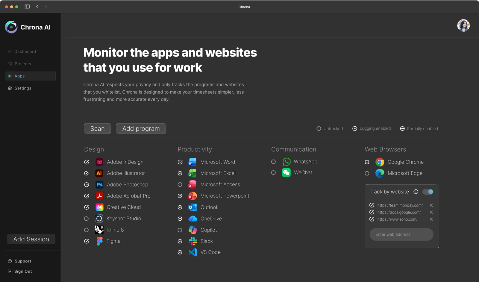
Chrona automatically searches the user’s device to find installed applications. This intends to reduce friction and enable quick setup.
By default Chrona tracks nothing, users can use this page to enable an application for use with the software. If the user selected a preset during setup, applications associated with that preset with be set to tracked.
Users can disable blanket tracking of a browser, and instead enable domain-specific tracking. Meaning that Chrona will only monitor your access to work related websites.
Trust & privacy
Even with opt-in tracking, there are moments where users don’t want any observation at all. A single control lets users pause tracking instantly, creating a private moment without friction.
This decision trades accuracy for acceptability, and that distinction is what determines whether a product like this gets adopted or abandoned.

Outcome
Chrona shifts time tracking from something users create to something they confirm. Entries are based on real activity, not end-of-day estimates. The review step is lightweight by design; most sessions need a single click.
What changes
Reduced effort
A lightweight review of the generated timesheet.
Improved accuracy
Entries are based on real activity, not retrospective estimates.
Better engagement
No interruption to flow or end-of-day reconstruction.
At a system level
More reliable data for teams
Reduced administrative overhead
Higher likelihood of consistent adoption
Reflection
Designing AI as a co-pilot
What started as a timesheet tool kept pulling me back to the same question: where should the AI stop?
The real challenge wasn’t automation, but earning trust while automating. That meant making the system’s behaviour visible rather than hidden, letting users override decisions without friction, and ensuring nothing crossed the line into feeling like surveillance.
The more I worked on this, the more I came to think that legibility mattered more than capability. A system that does slightly less but stays understandable is more useful than one that does everything and can’t be questioned.
The individual experience solves the input problem. But the data is only valuable if someone can act on it. The logical next step is a project manager view – surfacing accuracy trends, flagging under-reported projects, and giving leads the visibility that timesheets were always supposed to provide but rarely did.