Intuitive enough to require little to no training in theatre.
Quadsense
Innovating knee arthroplasty
Role
Lead UI/UX Designer
Team
Orthopaedic surgeons
Biomedical engineers
Software developers
Responsibilities
UX Research
User Workflow Mapping
Interaction Design
Information Architecture
Data Visualisation
Usability Testing
Prototyping
Tools
Figma
Illustrator
Photoshop
After Effects
Outcome
£3.8M funding secured, regulatory approval in UK, US & NZ, deployed in 300+ surgeries.
The problem
Over two million total knee replacements are performed every year. Up to 20% of patients remain dissatisfied with the outcome, most commonly due to poor patella tracking and alignment. Even small misplacements cause chronic pain, reduced mobility, and revision surgeries that contribute to a $6.5B global burden.
The root cause is a gap in intraoperative information. Surgeons make critical alignment decisions without any way to quantify the forces acting on the knee in real time. They rely on experience and feel alone, with no feedback until the patient is in recovery.
Quadsense, developed with Eventum Orthopaedics, was built to close that gap. The product gives surgeons live biomechanical data at the moment it matters most.
20%
Dissatisfaction
Out of 2 million+ knee replacements annually, up to 1 in 5 patients remain dissatisfied with their surgical outcome.
$6.5B
Global Burden
Poor patella alignment drives chronic pain and costly revisions, contributing to a multi-billion dollar global financial strain.
Key insight
Surgeons make critical alignment decisions without being able to quantify forces in the knee – contributing to avoidable repeat surgeries.
Opportunity: surface complex biomechanical data as immediate, intuitive feedback, enabling confident decisions in the moment without breaking surgical flow.
The system
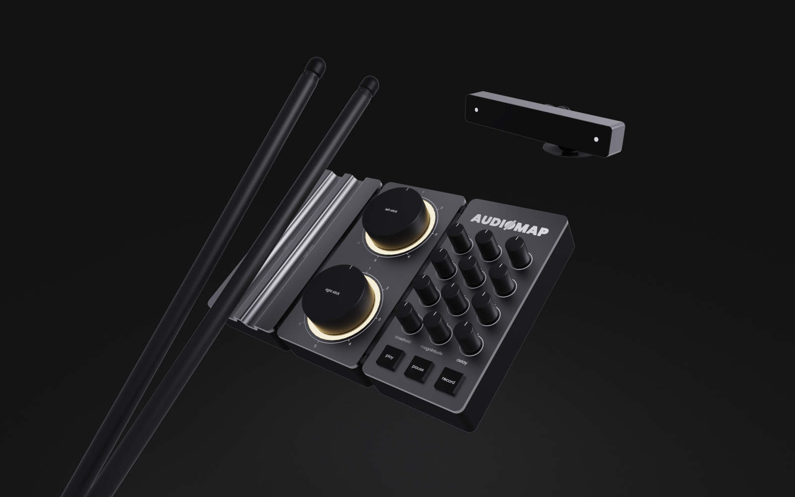
Quadsense is a hybrid surgical system: a physical sensing device paired with a real-time digital interface.
A sensor attaches temporarily to the patella during surgery, capturing force data throughout flexion and extension. That data streams live to a screen in theatre, visualised as clear, comparable load traces. A sterile control puck lets the surgeon navigate the interface without breaking scrub.
The design challenge wasn’t the hardware. It was turning previously unmeasurable biomechanical data into something a surgeon could interpret instantly, under pressure, mid-procedure.
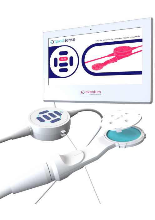
Force Sensor
Captures real-time patella force data during flexion and extension, translating biomechanical interaction into measurable input.
Captures real-time patella force data during flexion and extension, translating biomechanical interaction into measurable input.
Control Puck (Input Device)
Provides sterile, tactile input for navigating the workflow and recording readings without breaking surgical flow.
Provides sterile, tactile input for navigating the workflow and recording readings without breaking surgical flow.
Screen (Digital Interface)
Visualises force data as clear, comparable load traces—enabling rapid interpretation and confident intraoperative decisions.
Visualises force data as clear, comparable load traces—enabling rapid interpretation and confident intraoperative decisions.
Requirements
I worked with orthopaedic surgeons and biomedical engineers through interviews and focus groups to understand how the system needed to fit into existing theatre workflows. The consistent message was that any friction, or any moment where the interface demanded attention away from the patient, was unacceptable.
Four requirements came out of that process and shaped every subsequent decision. These weren’t aspirational goals. In a surgical environment, failing any one of them would mean the product simply wouldn’t be used.
01
Ease of use
Must fit existing surgical workflows without friction or behavioural change.
02
Low Cognitive Load
Information must be instantly legible in a high-pressure environment.
03
Efficiency
Support fast, precise decision-making with minimal interaction overhead.
04
Rapid Adoption
Method
I led the end-to-end UX process, from early concept development through user testing and synthesis, working in rapid test → learn → refine cycles at each stage.
Every decision was validated directly with surgeons rather than assumed. In a clinical environment where the cost of a wrong call is measured in patient outcomes, grounding the work in real feedback wasn’t optional, it was the only way to build something that would actually be used in theatre.
Defining the workflow
The first design problem was structural. A surgical interface isn’t used casually – it follows a procedure, and it has to map to that procedure exactly. I spent time with surgeons mapping the full intraoperative journey, then reduced it to a focused five-step flow:
Setup → Baseline → Comparison → Analysis → Decision
To get early alignment across the team, I translated this flow into a written UX script, a plain-language walkthrough of every screen and interaction, written before any visual design began. Stakeholders could review and push back on the logic of the experience without getting distracted by aesthetics. By the time we moved into design, the flow was validated and shared understanding was established.
01
Start & Setup
The surgeon selects the workflow (Streamlined or Advanced) and confirms left or right knee.
02
02
Enter Patient Data
In Advanced mode, patella thickness and implant details are entered, tailoring the workflow to the patient.
03
Baseline Recording
With the sensor attached, the surgeon records flexion–extension cycles. The system plots forces to create a baseline graph.
04
Comparison Reading
After trial implants are inserted, the surgeon repeats the process. A second graph appears, directly comparable to baseline.
05
Data Analysis
The software highlights differences in patella forces. Surgeons can toggle between load traces to spot imbalances.
06
Additional Readings
Alternative shims can be tested. Each new reading is logged with its parameters for easy comparison.
07
Decision Support
Advanced mode calculates resection depth/angle if needed and flags risks if the patella becomes too thin.
08
Confirm & Finish
The surgeon confirms implant size and resection choice, ending the workflow and proceeding with implantation.
Interface design
With the workflow settled, I moved into wireframing and prototyping with a clear brief: reduce visual noise, surface critical data, and ensure everything was readable at a glance in a theatre environment.
Two decisions defined the interface architecture.
The first was a persistent on-screen representation of the control puck. Rather than asking surgeons to memorise button mappings, the interface showed exactly what each button did at each stage of the workflow. This made the physical device adaptable — the same hardware could serve different functions at different points without any ambiguity.
The second was keeping the layout stable throughout the procedure. Rather than navigating between distinct pages, the right side of the screen adapts to the current workflow stage while the left stays constant. This builds familiarity quickly and means the surgeon always knows where to look.
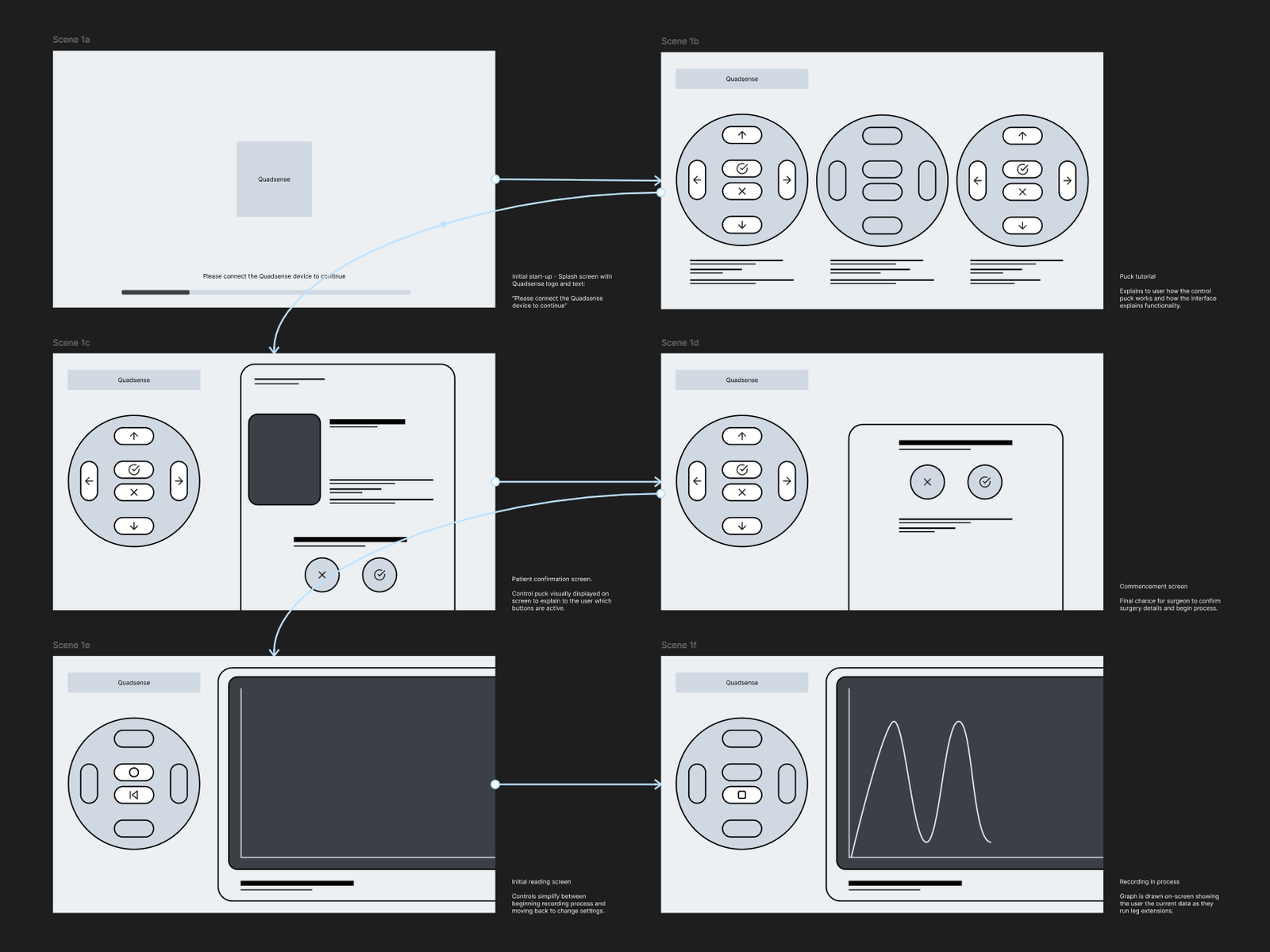
To make device operation simple, an on screen representation of the control puck was chosen to be displayed. This enabled the physical control device to become adaptable, and multiple functions could be mapped to the buttons depending on the specific stage of the workflow.
To reduce cognitive load it was decided that the software wouldn’t flick between unique pages and states. Instead, the right of the display can adapt to the current stage of the workflow, building familiarity with the interface and prioritising the information needed at a stage.
Validation
Interactive prototypes were tested directly with surgeons to simulate the full procedure flow and surface any navigation or legibility issues before development began. Testing confirmed the core workflow held up under theatre conditions, the step-by-step structure mapped cleanly to how surgeons actually moved through a procedure.
It also exposed the interface gaps that drove the refinement phase: the graph needed more screen real estate, key metrics were buried, and the puck mapping created moments of ambiguity under pressure. Those findings fed directly into the refined UI.
Interface refinement
Early clinical testing validated the workflow and core interaction model. It also made clear that the initial interface, built under significant time pressure, lacked the visual hierarchy and persistent information needed for confident use in theatre. Surgeon feedback pointed to specific gaps: data that required navigation to find, physical controls that didn’t map cleanly to the screen, and graph rendering that demanded too much interpretation mid-procedure.
I developed a refined UI to address each of these directly.
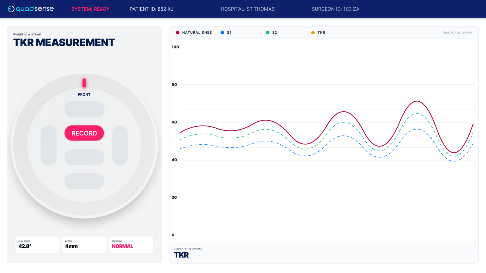
1
High-Contrast Data Visualisation Primary graph expanded and prioritised (~60% of screen) with increased contrast for rapid, at-a-glance comparison during flexion cycles.
2
Persistent Surgical Context Patient and hospital identifiers remain visible at all times, ensuring data is correctly attributed and reducing risk of error.
3
Decision-Critical Metrics Key implant and measurement data (e.g. depth, angle, pressure) surfaced inline—eliminating the need to navigate away from the primary task.
4
Clear Physical–Digital Mapping Puck representation includes orientation and directional labelling, aligning the physical device with on-screen feedback and reducing ambiguity.
Due to project timelines, the original interface was the version used in clinical validation and early surgical deployment. The refinements represent the production direction — a more considered response to what real theatre use revealed, and closer to the standard the system deserved from the start.
Key Improvements
01
Persistent Surgical Context
Introduced always-visible patient and hospital identifiers, allowing surgeons to verify that readings were correctly associated with the active case—critical for clinical confidence and record integrity.
02
Decision-Critical Metrics
Surfaced implant-related metrics derived during the procedure (e.g. resection depth, angle, pressure state), ensuring key variables were immediately accessible without navigation.
03
High-Legibility Data Visualisation
Redesigned the graph to occupy the majority of the interface (~60%+), with increased contrast and simplified styling. This enabled rapid comparison between readings and improved glanceability during flexion cycles.
04
Clearer Physical–Digital Mapping
Refined the on-screen representation of the puck with explicit orientation and directional labelling, reducing ambiguity between the physical device and digital feedback.
05
Stronger Interaction Cues
Increased contrast and prominence of primary actions (e.g. Record), making interaction states unambiguous in high-pressure conditions.
Design Language
In a theatre environment, poor contrast or inconsistent iconography is a functional problem, not just an aesthetic one.
I defined a system covering typography, colour, and iconography optimised for legibility under clinical conditions, while remaining consistent with Eventum’s brand identity. The result was an interface that communicated precision and trust as much as it communicated usability.


Project outcome
£7M in total funding secured, including £3.8M from NPIF II. Regulatory approval across the UK, US and New Zealand. Deployed in over 300 surgeries, with growing international adoption.
”“Quadsense guides me in the surgery where previously I didn’t have a guide.”
Professor David Barrett BSc MB BS FRCS
Reflection
Designing for a clinical environment changes how you think about every decision. When the interface is part of a system that directly affects patient outcomes, “good enough” isn’t a position you can defend. To users, to auditors, or to yourself.
Working within the constraints of ISO 13485 certification also meant that design couldn’t operate in isolation. Decisions had to be defensible not just to users but to auditors and regulatory bodies, which pushed the documentation and validation work to a standard I hadn’t previously worked to. That rigour is uncomfortable at the time, but it produces better design. It forces you to defend every call you make.
The interface that went into clinical validation wasn’t the version I would have chosen given more time. The refinements I developed subsequently are closer to what the system deserved from the start. But the measure of a surgical tool isn’t how it looks in a portfolio. It’s whether surgeons trust it in theatre. Over 300 procedures completed, £7M in funding, and regulatory approval across three territories suggests that even under significant time and resource pressure, the core design decisions held up where it mattered most.